
Styling and themes
Colors, fonts, swatches, and reusable themes.
Qbit styles pages in layers, from broad to specific. Understanding the layers means you'll always know where to make a change - and change things once instead of everywhere.
The four layers
- Defaults - every page starts presentable out of the box.
- Theme - a reusable style set (colors, fonts, buttons) shared across pages. Qbit themes are ready-made and included on every plan; creating your own is a Premium feature.
- Custom Appearance - this page's own overrides, layered on top of its theme.
- Block styles - settings on one specific block, which win over everything.
More specific always beats more general. Clear a specific setting and the layer below shows through again.
Styling this page
On the Appearance tab, under Custom Appearance, work through the rail. Foundations come first:
- Color Swatches - name your brand colors once, then pick them everywhere. Update a swatch later and everything using it follows.
- Text & Font - the fonts, colors, and sizes of body text, headings, and button labels. The font picker offers 40+ fonts across sans-serif, serif, monospace, and handwriting styles.
- Page - background color or image, text color, padding, and width. Click Choose image under Background image to pick a picture from your media library. For sections whose backgrounds run to the edges of the screen, set Vertical padding and Horizontal padding to None and give each Group padding of its own in its Style.
Below them, Blocks sets the default look for every block of a kind on this page: Button, Social Links, Form, Menu, Events, and the rest.
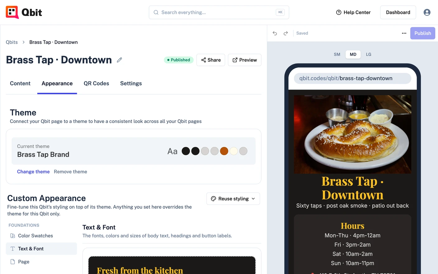
To style a single block instead, click its card on the Content tab and open Style in its panel - fonts, colors, borders, spacing, and alignment per block, with Reset custom styles if you want a do-over.
Working with themes
A theme carries one look across every page. There are two kinds: Qbit themes, made by Qbit and ready to use, and your themes, which you design yourself (Premium).
-
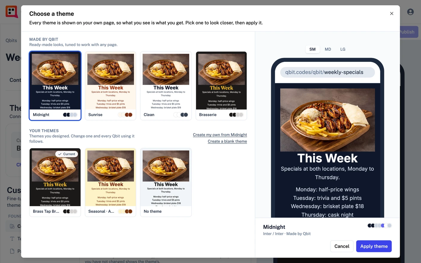
Apply one: Appearance tab → Change theme, pick a theme under Made by Qbit or Your themes, then click Apply theme. Every theme is shown on your own page, so you see the result before you apply it. The change goes into the page's draft; publish the page to make it live. Remove theme takes the theme off the page.
-
Browse Qbit themes: the Themes section in the left nav. Open one to see it on sample pages, then choose Use this theme and pick a page. A page on a Qbit theme picks up improvements when Qbit updates that theme.
-
Create your own: Themes → Create a Theme. Start from blank, from one of your themes, or from a Qbit theme, then change anything. The theme you started from stays as it is.
-
Edit one of yours: open it from Themes. Theme edits are drafts until you publish them - then every page using the theme updates at once.
-
Create one from a page you like: Appearance tab → Reuse styling → Save as a theme. Your hand-styled page becomes a theme you can apply anywhere. Copy to another Qbit does the same for just one other page.
The practical rule
Put brand-wide decisions in the theme, page-specific tweaks in Custom Appearance, and one-off exceptions on the block. Future-you, updating the brand color in one place, will be grateful.
Still stuck? Email support@qbit.codes.